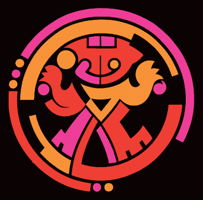
The all-girl, Karma Team wanted a logo for their 2015 Ocean to Ocean cayuco.
The Ocean to Ocean starts in the port of Colon and ends at the Port of Balboa, Panama. The first leg is on Friday and runs from the old Cristobal Yatch Club to the entrance of the Gatun Locks on the Atlantic side. The second leg on Saturday runs across Gatun lake to the Dredging Division in Gamboa. The fastest boats do this leg in under 3 hours. Sunday has various legs between Gamboa to the Port of Balboa.
The original boats were shaped from a single tree truck. Today's 3rd generation cayucos are light weight plank boats.
Monday, March 30, 2015
Thursday, February 26, 2015
Trans CAD trucking company
“We need a logo for our trucking company. Do what ever you want, but do us something good!”
I’ve done several trucking logos over the years. They are always fun. My brief was movement, modern and keep it simple. This logo had certain givens like… an italic font, a bold or black weight, and explore a slab or a sans serif typeface.
The color palette was going to be easy because the owners love pro football. Immediately I thought of an orange and blue or black combination; Broncos, Colts, Bengals, Cleveland… aggressive visuals. Wonderful ingredients.
Some logos are a type solution from the get-go. One of the things I learned in design school that has helped me all my life is… keep an idea file. Look and save for the future.
I remembered a Brazilian logo that I saved because of the lowercase “a”. After a couple of hours searching the Net I downloaded 5 fonts similar to the Brazilian letter "a" and starting playing around.
The last thing I worked on was the icon. Started sketching arrow tips and boomerangs with coloured pencils. Bing bang boom…. TransCAD is born.
Labels:
branding,
logo design,
Mark Hanly,
Panama,
TransCAD,
transportation,
trucking
Alegría Series of Buildings
The project brief required a logo that could be used on a series of 10 residencial buildings to be built over a 5 year period.
The client also wanted to create a brand name that would unify the series. In the market names of European cities was common. The client wanted to go beyond that and create a name that had a reason why... something positive.
The winning concept was “Alegría”. Translated into English it is a blend of “happiness and joy”. "Alegría" was translated into 9 different languages. It was important that the translations be short words and easy to pronounce in Spanish with less than 3 syllables.
I set up 3 simple parameters to give the series structure and continuity: 1.) a sans serif font that wouldn't age with time, 2.) a simple icon that could be painted with different colours and 3.) a common color for the name.
Labels:
bienes raices,
branding,
Haus Panama,
logo design,
Mark Hanly,
real estate
Wednesday, September 30, 2009
RPC TV

Back in 1992 RPC Tv asked to see ideas for a modern version of their icon. The previous year I had conceptualized and executed all the station IDs and program promos. Their symbol was a pre-colombian design of a crowned warrior. During the 3-4 month long project I baptised him as "Totumito".
I broke down the original indian symbol and rebuilt a new version with geometric shapes with bigger and simpler parts.
I think the inhouse designers at the station have done a great job with a new version of the logo. The font is dynamite as well as the red on grey.

Labels:
branding,
logo design,
logos,
Mark Hanly,
Panama,
television logo
Topsi Ice Cream


In 2008 the Topsi Ice Cream brand was given a face lift. These logo proposal combined new typography and characters. The following images show the final logo.


Labels:
branding,
logo design,
logos,
Mark Hanly,
Panama,
Topsi Ice Cream
Topsi Ice Cream


Topsi is an established ice cream brand in Panama. This project only required a new packaging design. But simple projects are great opportunities to give the product, an ice-cream sandwich, a brand embassador. Wala... the pink polar bear.
Labels:
branding,
logo design,
logos,
Mark Hanly,
Panama,
Topsi Ice Cream
Quencher (Jamaica)

The fun part of creating logos is when they tell you the project is about coming up with a brand character. Coming up with characters breaks all kinds of monotony and makes you a kid again.
Quencher was such a project for my good friend and mentor, Mike Hirst, in Jamaica. Mike asked, "Wat dat ting 'anly?" "Buay u kiant see it a juice-loving devil-ting dat most quench 'im terist... mista 'irst", I replied in an email.
Labels:
branding,
logo design,
logos,
Mark Hanly,
Panama,
Quencher.
Subscribe to:
Comments (Atom)


