Wednesday, September 30, 2009

RPC TV


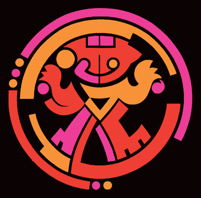
Back in 1992 RPC Tv asked to see ideas for a modern version of their icon. The previous year I had conceptualized and executed all the station IDs and program promos. Their symbol was a pre-colombian design of a crowned warrior. During the 3-4 month long project I baptised him as "Totumito".

I broke down the original indian symbol and rebuilt a new version with geometric shapes with bigger and simpler parts.

I think the inhouse designers at the station have done a great job with a new version of the logo. The font is dynamite as well as the red on grey.


Topsi Ice Cream


In 2008 the Topsi Ice Cream brand was given a face lift. These logo proposal combined new typography and characters. The following images show the final logo.


Topsi Ice Cream


Topsi is an established ice cream brand in Panama. This project only required a new packaging design. But simple projects are great opportunities to give the product, an ice-cream sandwich, a brand embassador. Wala... the pink polar bear.

Quencher (Jamaica)


The fun part of creating logos is when they tell you the project is about coming up with a brand character. Coming up with characters breaks all kinds of monotony and makes you a kid again.

Quencher was such a project for my good friend and mentor, Mike Hirst, in Jamaica. Mike asked, "Wat dat ting 'anly?" "Buay u kiant see it a  juice-loving devil-ting dat most quench 'im terist... mista 'irst", I replied in an email.

Terrasur Engineered Floors


Terrasur is a line of tropical hardwood floors made to European standards and exported to the USA and Europe. It was created in 2005 and the project included research, name proposal, logo and application design.

Super 99 (Panama)


In 2007 I presented a new business pitch to a large, supermarket chain. The project was done by the book with face to face interviews with customers to understand the pros and cons of the brand. The brand was solid in terms of locations and pricing, but begged for a face lift. I included three logo proposals for consideration.

Sadly for us the owner of the SM chain entered politics, won and is now the current President of Panama. We never got the chance to show him some great work. Next! Another day.

Reciclajes Integrales, S.A.


A business group saw the need for a company that could pickup used oil from ships, truck fleets, repair shops, oil change shops and gas stations, clean it and recycle it as a low-grade fuel. The color green was important as well as white and black.

Mega Depot


This logo was a face lift for an old brand. Mega Depot is a warehouse, bulk shopping store offering food, auto, home, garden, liquor and more. The new logo was tied in with an advertising campaign promoting "buy big".

Productos La Doña


Not all corporate identity projects are about starting from a clean pencil stroke. This 30 year old company just wanted to modernize their icon. The original "aproned chef" had a cooking spoon in her left hand a steaming pot on a stove to her right. A typical logo for the 70s!

After much debate the owner was true to his original trademark and accepted a full color illustration of the "cooking chef" and some new type. You can't win them all.

Hanly Design Group


In 1994 I started Hanly Design Group, a small design firm specializing in corporate identity, packaging, books, annual reports and corporate advertising. It was an exciting year because it was a time to learn web design.

I started HDG with a large local bank as my first client. A few months into this new stage of my life i sat down to create a logo that was symmetrical, with a 3x2 footprint, only one color, and simple. Wham Bam I was happy with my first sketches.

Centro Cuatro Altos (Colon, Panama)


Concept design for a shopping center to be promoted and built in the Colon province in 1998.

Autique (Ricardo Pérez, S.A.)


Autique was the Toyota Dealer's accessory boutique offering rims, spoilers and other pimping goodies before "pimping" became a multimillion dollar business.

Thursday, August 6, 2009

Kitras & Kitras Seguros (Panamá)

Tower Securities, Inc. (Towerbank Panama)

Sistema Clave Panamá

Paul Smith

Subway Jeans

Metro Plaza, S.A.

Museo del Niño de Panamá

Maderas y Materiales de Construcción, S.A.

Panamonte Hotel & Estates (Boquete, Panamá)


Hospital del Niño de Panamá (50 Aniversario)

Formas Universales, S.A.

Electra Noreste de Panamá

Dirección General de Ingresos de Panamá

Clinica de Ojos Orillac

Calox Panameña, S.A.

Wednesday, August 5, 2009

Supermercados Mr Precio


Mr Precio is a supermarket chain for low-end markets. Once again "keep it simple" ruled the day and a letter "C" became a "cent" symbol.

Hosanna Visión TV


This design project was a first - a logo for a christian television station. The Hosanna Visión Television logo was paid for but never used. I show case it with pride because its about type, simplicity and a symbol that wasn't a cross.

Café Eleta


The founder of Café Eleta wanted to incorporate the family crest into his gourmet brand of coffee.

Farmacias Metro


At the heart of my designs you'll always find a concept and simplicity. We could call it an old-school approach, but it works. An "x" on the "R's" right leg and bing, bang, boom we've got a all-in-one logo.

Asociación Nacional de Conciertos de Panamá


The national flower of Panama is a white orchid called the "holy ghost flower" (Periferia Elata). In the center is the shape of a small pigeon. It is one of a kind and very beautiful. Perfect for the logo of a non-profit group that provides instruments and music camps for young musicians with funds obtained from classical concerts.

Almacén Adams


Almacén Adams is an upscale mens clothing store that used Adam's apple successfully in their advertising. Things that happen in branding - a strong communication device becomes a brand. The previous version of the logo had a large apple and the name. I joined them for simplicity and reduced the foot-print.

Banco Comercial de Panamá, S.A.


Probably one of the first logos I created in Panama. Must of been around 1978.

A principal investor asked me to whip something up for a board meeting he had in a couple of days. I sent him some sketches of an icon with a winged horse. With a Pegasus a new bank was born.

Aereo Club de Panamá


A local flying club requested a symbol for their group. Something they could put on their planes and hats.

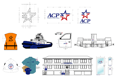
Autoridad del Canal de Panamá


With the transition of the Panama Canal to the Republic of Panama in 2000 a new logo was implemented. The concept for the icon combined the colors and double stars from the flag and the passage between the Pacific and Atlantic Oceans.

Tuesday, August 4, 2009

Jam Patty


Logo created in 2004 for Caribbean Patty, bakers of Jamaican Patties. These meal-size turnovers are baked in Panama and taste just like the originals in Jamaica. Having lived in Kingston for many years and enjoyed many a lunch with a soda and patty, I wanted an all-in-one symbol that said "me de real ting man".